Before we do front-end job, we usually have a mockup (png or psd) from the visual designer, and we start to handcraft html, css and javascript. we can mark the dimensions on the mockup by some tools like specctr or getmarkman, to make the process easier.
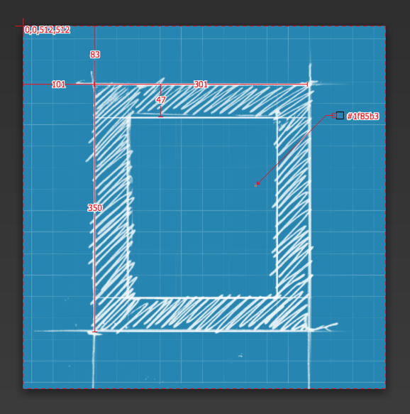
But, it’s annoying to switch your focus between the mockup and what you do in browser again and again, and it’s not intuitive. So my solution is make a full screen div to cover the whole page, with the mockup in it.
html structure:
body
  #blueprint
  ..start developing here
a part of sass:
#blueprint
  position: absolute
  left: 0
  top: 0
  right: 0
  bottom: 0
  z-index: 9999 // to arrange z-index, a reference: http://goo.gl/t5fkNr
  opacity: 0.5 // up to you
  pointer-events: none
  background: url(images/your-mockup.jpg)
Now, our mockup is a blueprint, you can use developer tool to tweak the size, position, ensure they are all precise. When it is finished, you can remove it.
Sometimes I think it’s finished, but the boss / client / designer don’t think so, they say “This is bigger than original design” blahblah. In this case, you can add something in css and javascript
a part of sass:
#blueprint
  display: none
  .tweak &
    display: block
coffeescript:
$body = $('body')
$(window).on 'keydown', (e) ->
  $body.toggleClass('tweak') if e.which == 192 # this is `
so you can switch the original design / your page to them.