This trick can detect if the content is wider than the container and it will display a icon if the container is too narrow, so you can click on the icon to expand.
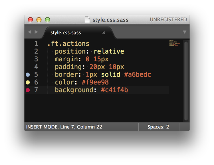
The main thing is to use { text-align: justify } and set the .mask element width to 1px and give it a higher z-index to cover the icon. When the .content width is full of the container({max-width: 100%}) the mask would wrap to the second line. Then the icon shows up, then you can click on the icon to show the second line.
See the Pen vbour by Oliver - Frontend Developer (@Oliverl) on CodePen.


